Next level performance for your business.
Yukka Lab is a Berlin-based AI fintech company specialising in real-time sentiment analytics for institutional investors. As part of their strategic evolution, I led the UX/UI redesign and brand refresh to elevate their digital presence, clarify their product offering, and better engage a data-driven audience.
The new design enhances usability, modernises the brand identity, and aligns with the expectations of high-profile clients such as asset managers, banks, and financial data platforms.
Project details
Challenge:
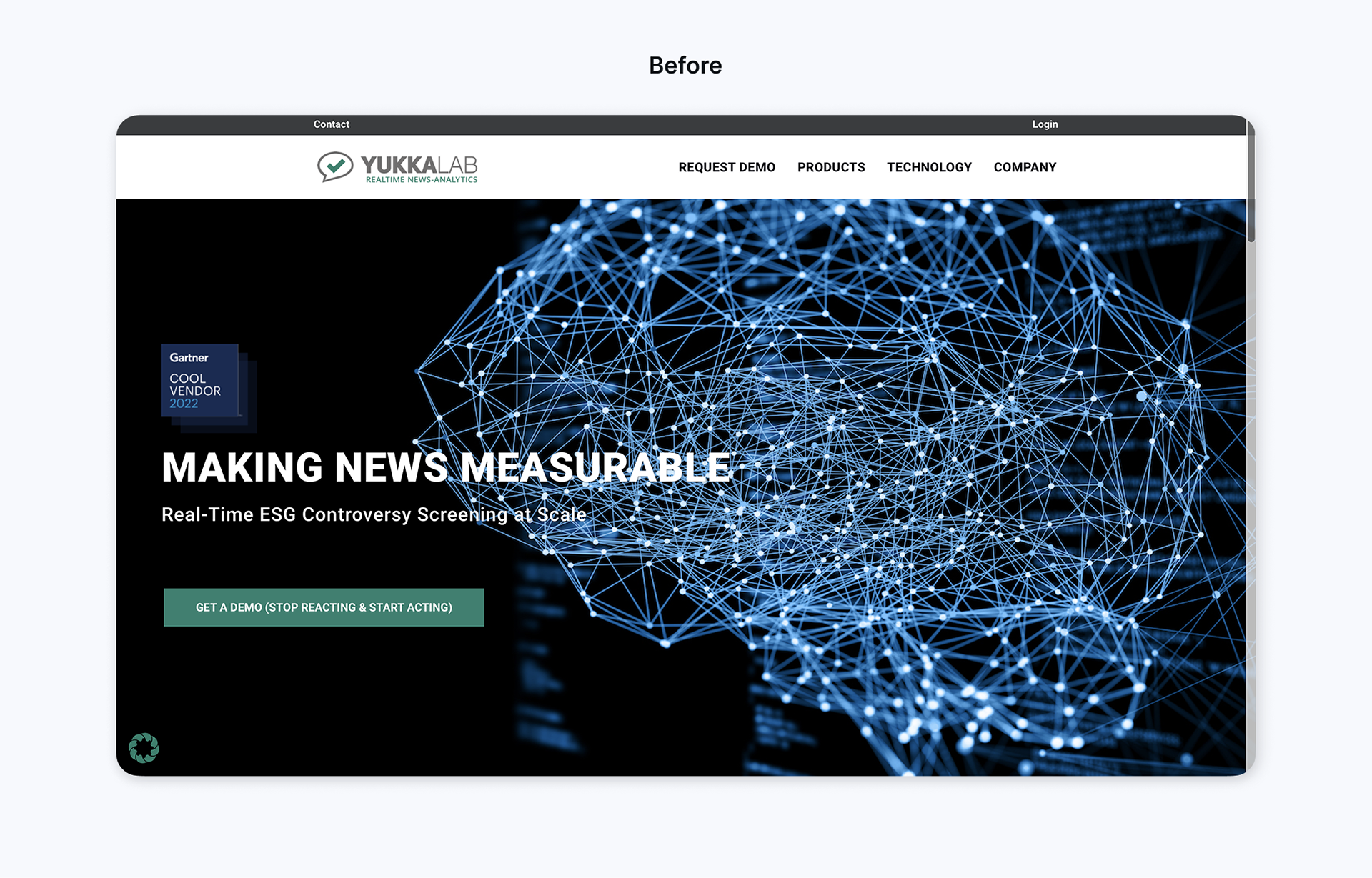
The client’s existing brand and website no longer reflected the maturity or direction of their business. They needed a full brand refresh and website redesign to present a more modern, credible, and investor-ready image. The goal was to create a cohesive visual identity and digital experience that aligned with their values, improved user engagement, and built trust with their target audience.
The client’s existing brand and website no longer reflected the maturity or direction of their business. They needed a full brand refresh and website redesign to present a more modern, credible, and investor-ready image. The goal was to create a cohesive visual identity and digital experience that aligned with their values, improved user engagement, and built trust with their target audience.
Solution:
Yukka Lab underwent a brand and website transformation to better reflect its position as a leading AI-driven analytics provider, helping financial professionals access ESG and financial insights with clarity and confidence.
Yukka Lab underwent a brand and website transformation to better reflect its position as a leading AI-driven analytics provider, helping financial professionals access ESG and financial insights with clarity and confidence.
Project duration:
March - October 2024
March - October 2024
My role:
Lead designer for Yukka Lab’s brand refresh and website redesign — responsible for the visual identity, user experience, and end-to-end Webflow development.
Lead designer for Yukka Lab’s brand refresh and website redesign — responsible for the visual identity, user experience, and end-to-end Webflow development.
Tools:
Figma, Webflow, Adobe Illustrator, Miro.
Figma, Webflow, Adobe Illustrator, Miro.
Brand Discovery & Strategy
I collaborated closely with stakeholders to uncover the heart of the brand - its mission, values, and voice - and transformed those insights into a clear visual direction using visual audits, moodboards, and creative exploration grounded in competitive research.
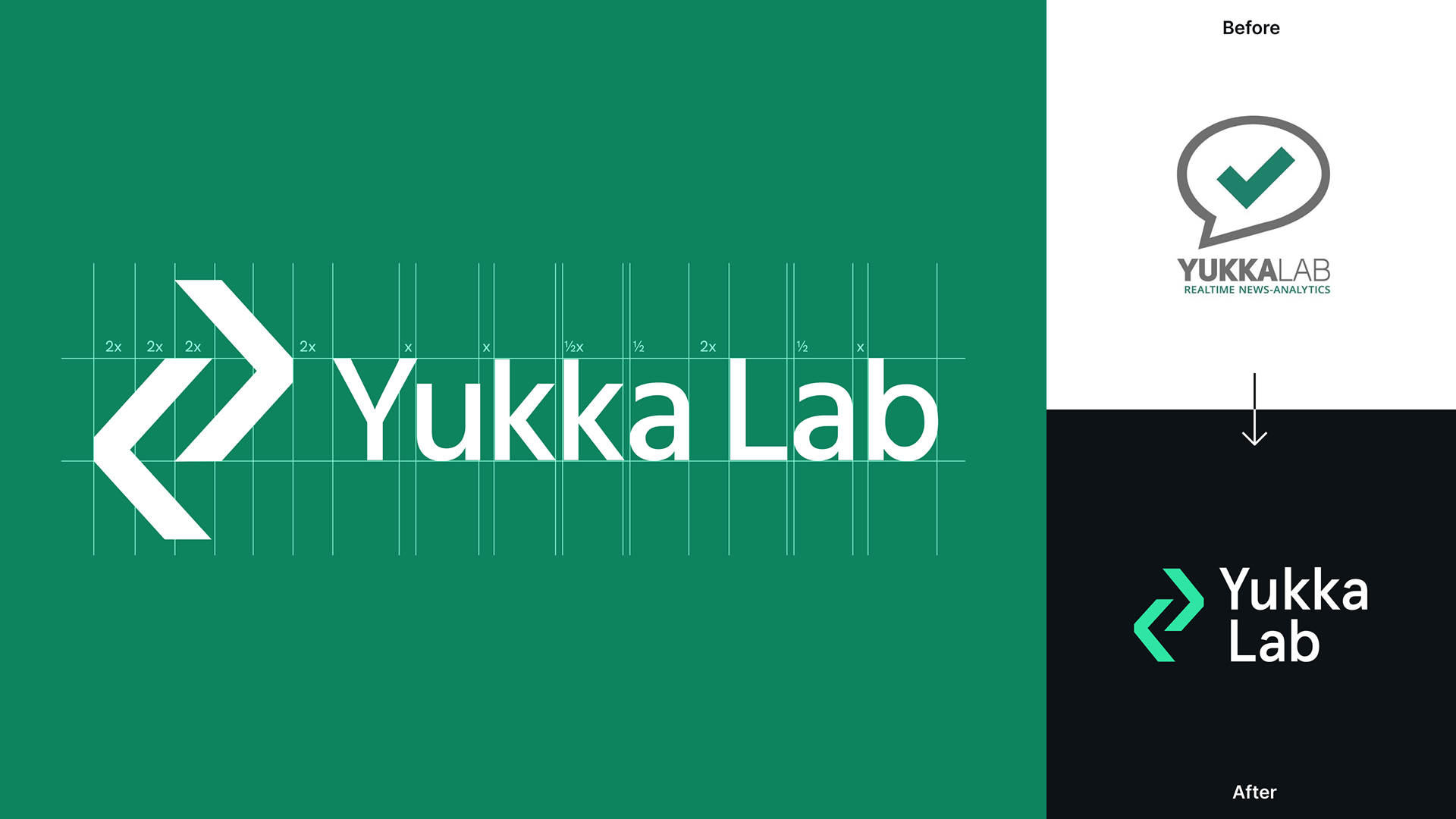
I designed the symbol to feel dynamic and directional—almost like a stylized data stream or an abstract algorithm. The angular lines hint at movement and flow, which felt like a natural visual metaphor for Yukka Lab’s real-time data processing and AI-driven insights. It was important to me that the logo didn’t just look techy, but that it also reflected the core function and personality of the product.
Visual Identity Design
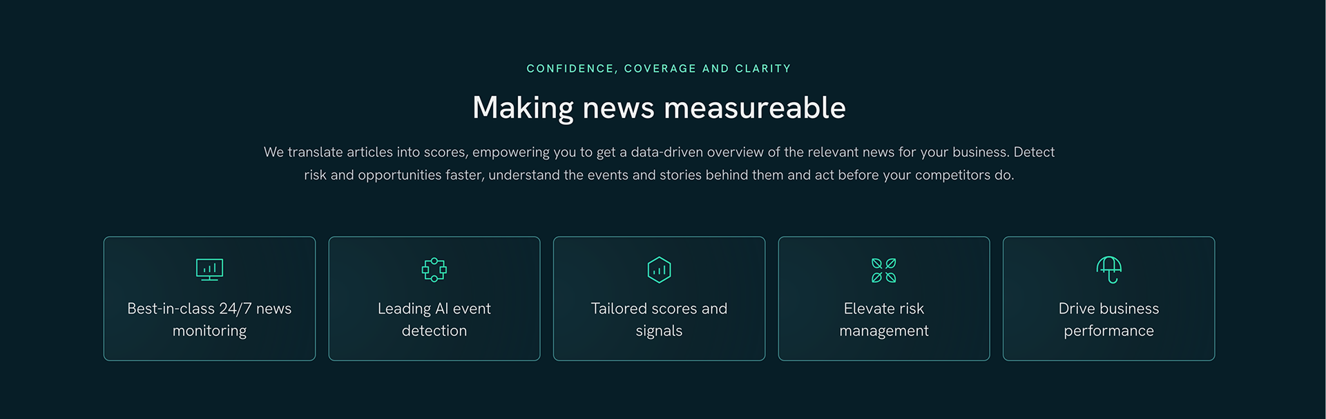
I brought the brand to life through a custom logo and icon system, a thoughtfully curated typography and colour palette, and a flexible design system—crafted to inspire trust, clarity, and consistency at every touchpoint.
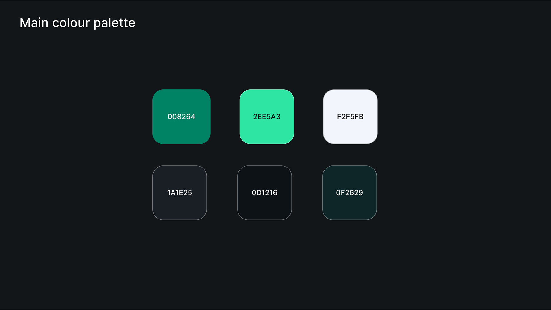
Our goal was to create a color system that feels contemporary and approachable, while maintaining the trust and clarity expected in the fintech space.
The original shade of teal as a primary color already aligned well with the goal of signaling innovation and growth. I expanded on this by introducing complementary green tones to strike a balance between freshness and credibility.
The dark background chosen for the new website enhances the technological and modern feel. Overall, the updated palette feels grounded and professional, which is essential for a SaaS product aimed at data-focused, institutional clients.
Logo variations
To maintain clarity and consistency, I created two green variants: a brighter tone for dark mode (as requested for the website) and a deeper one for light or print backgrounds. This ensures optimal contrast and brand integrity across all mediums.
The two shades of green were carefully selected with accessibility in mind. By ensuring sufficient contrast between foreground and background elements, the palette meets WCAG guidelines and supports inclusive design. This approach not only enhances readability and usability for all users, but also reinforces the product’s credibility.

UX & UI Design
I translated the rough website wireframes provided to me by my client, into high-fidelity desktop and mobile designs in Figma, guided by user-centered principles to ensure clarity, accessibility, and a seamless experience across devices.
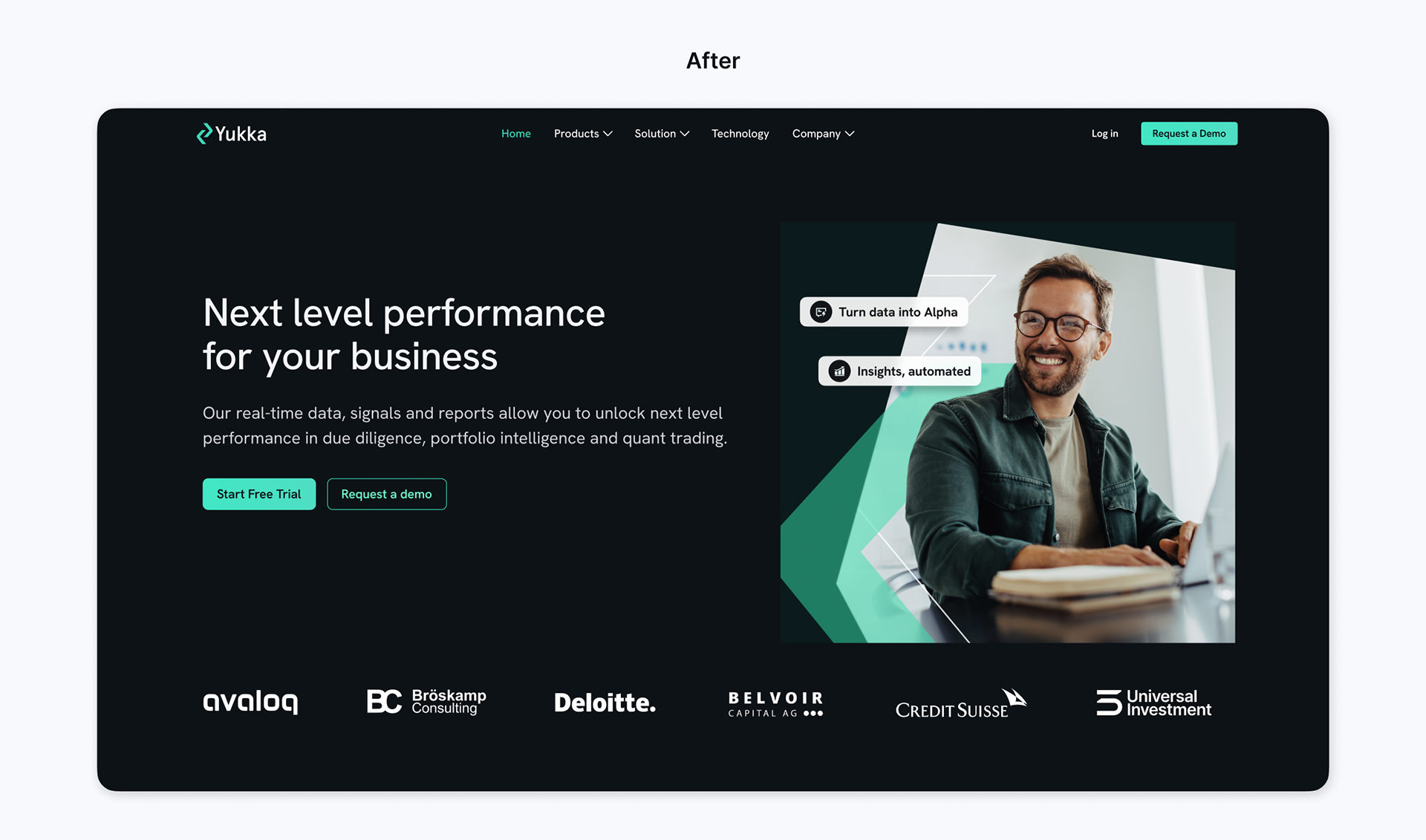
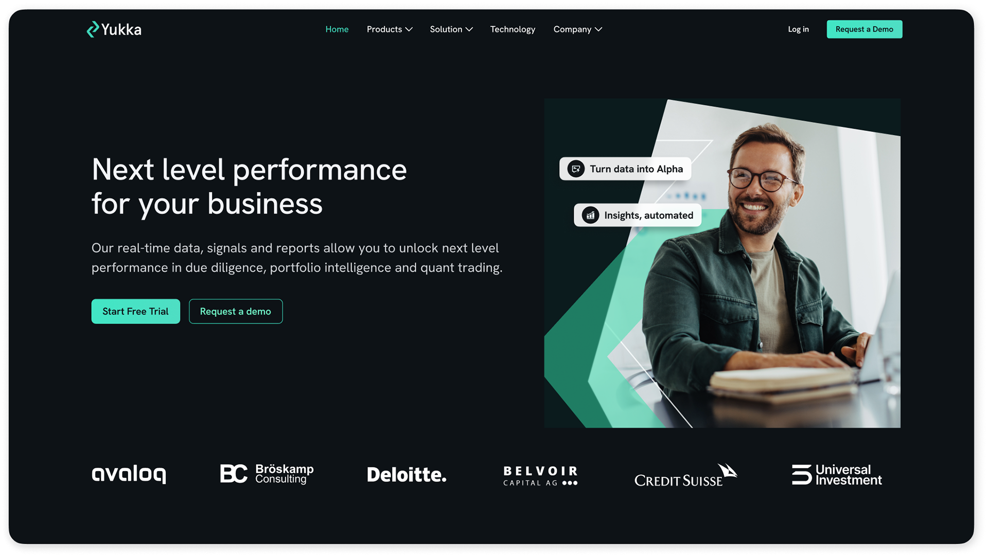
The new landing page (right) introduces a clean, modular layout with clear headings, concise messaging, and strong visual hierarchy.
A graphic image of a person was used in the hero section to add a human, relatable touch to an otherwise tech-heavy product, in order to create an emotional connection and signal that the product is ultimately built to empower people, not just algorithms.
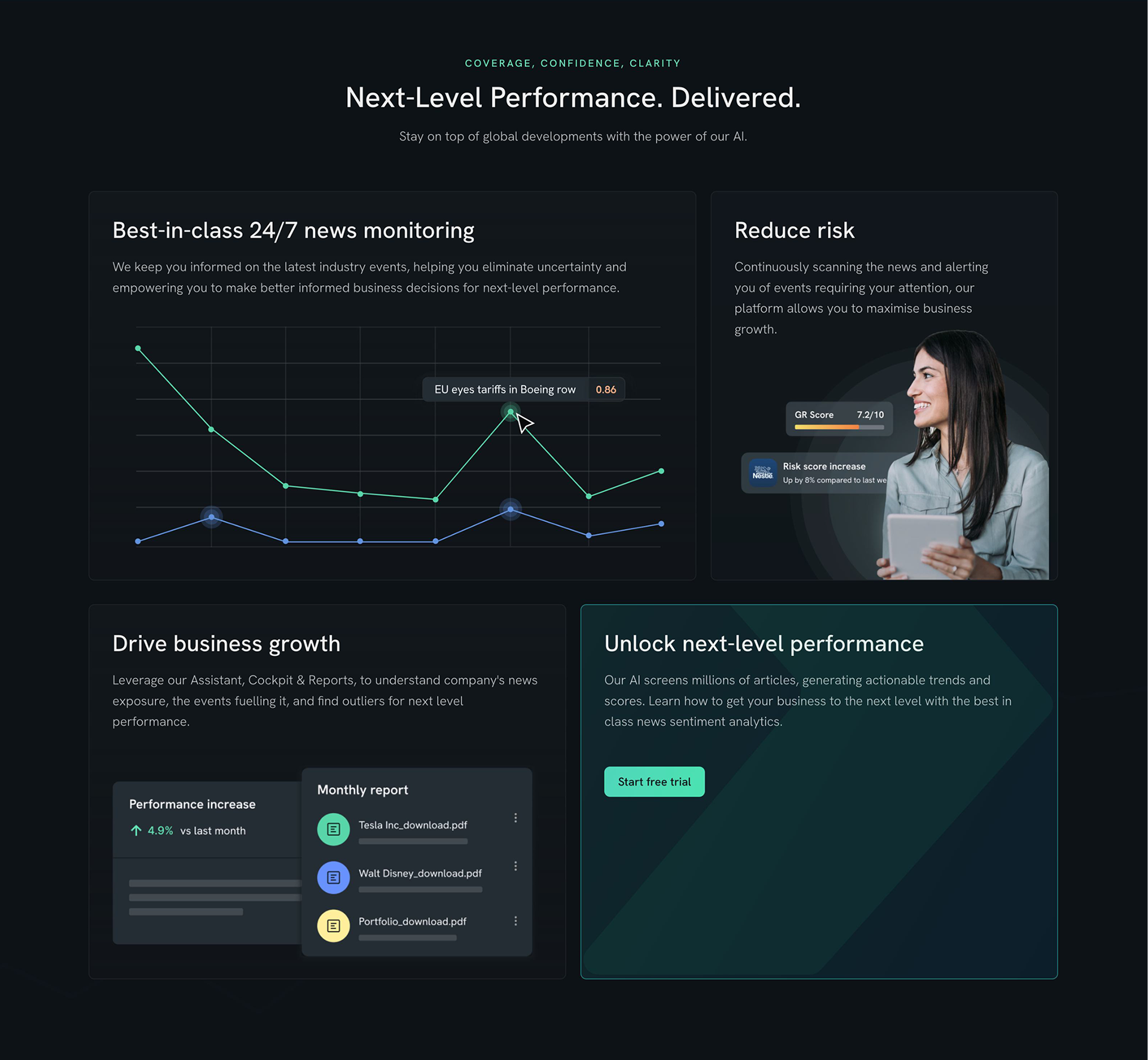
For Yukka Lab, the bento box layout helped present complex AI-driven features in a clear, modern, and visually balanced way, blending graphs and images with concise text and a strategic CTA to guide institutional users toward exploring the product.

A series of small cards were used here to make the key metrics easy to scan and understand at a glance. Subtle outlines give a sleek, modern look while maintaining clarity and focus. The use of bold numbers paired with short descriptors highlights impact without overwhelming the user.

These carousel cards effectively guide users toward individual use case pages, seamlessly blending visual storytelling with clear navigation. By incorporating human imagery, they soften the tech-heavy feel of the product and create a more relatable, user-centric experience.

A focused call-to-action section was strategically placed at the end of the homepage to reinforce user intent and drive conversions, guiding visitors toward starting a product trial with minimal friction.
Illustration work
In order to breathe life into the product and add a layer of warmth and engagement, I incorporated custom illustrations, all while leveraging the brand palette to ensure visual cohesion and reinforce identity across the site.

The illustration presents a simplified version of Yukka's dashboard, highlighting the most relevant insights potential clients would be eager to preview before committing to the product.


To support long-term brand consistency, I created a dedicated color palette specifically for illustrations. This ensures that as the client team continues to produce new visuals or expand the product, they can easily maintain a cohesive look and feel. The palette was designed to harmonise with the core brand colors while offering enough flexibility for expressive and engaging visual storytelling across different media.
Outcome
The new website for Yukka Lab effectively communicates the company’s ESG data expertise to enterprise and investor audiences. By creating a clear, credible visual identity and implementing a stakeholder-approved design system, I ensured the platform aligned with business goals while standing out in a competitive market.
My integration of Webflow empowered the team to manage content independently, while thoughtful UX decisions and data visualisation strategies improved user comprehension and engagement. The result was a high-performing site that boosted stakeholder confidence, with a 95% satisfaction rate and a measurable improvement in how users understood Yukka Lab’s value proposition.
Going Forward
Impact
The Yukka Lab project was about transforming a complex, data-heavy product into an intuitive and engaging user experience that builds trust with institutional clients. Through thoughtful UI/UX design, the platform now communicates its value more clearly, improves user flow, and encourages trial sign-ups.
What I learned
Working on the Yukka Lab project taught me a lot, both in terms of technical skills and design thinking. One of the key challenges was designing a fully dark-mode website that still felt warm, trustworthy, and human - a unique approach in the fintech and SaaS space where dark themes can often come across as overly technical.
Another key takeaway from the project was learning how to translate complex content into visuals that are clear, engaging, and easy to understand. This meant thinking critically about hierarchy, using layout and color to guide attention, and choosing the right visual metaphors to communicate abstract ideas. It taught me how effective UX design can make complicated systems feel intuitive and approachable.
Want to get in touch? Drop me a line!
Thank you!