Connecting homeless shelters with philanthropists.
Google UX Design - Project No.3
Project details
Challenge:
Design a dedicated mobile app and responsive website for homeless shelters that are struggling with resource scarcity.
Design a dedicated mobile app and responsive website for homeless shelters that are struggling with resource scarcity.
Solution:
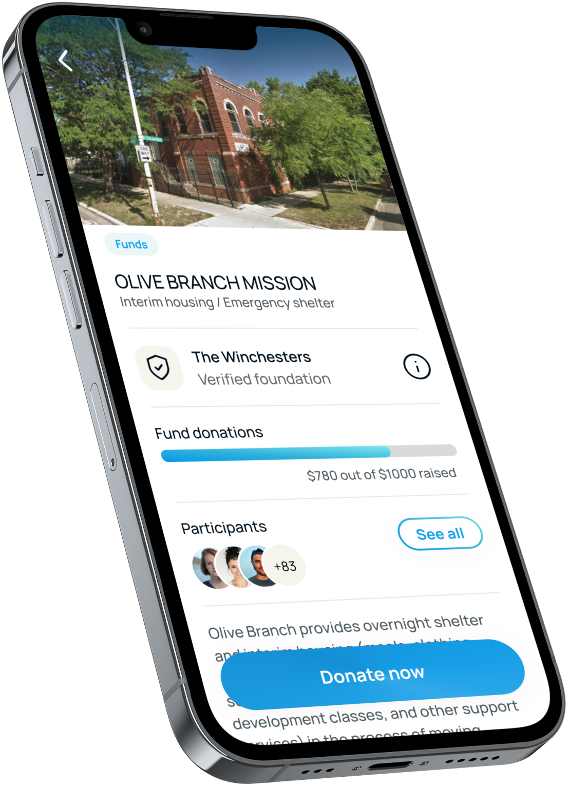
Helper is a product that allows users to find and support homeless shelters by making online donations.
Helper is a product that allows users to find and support homeless shelters by making online donations.
Project duration:
April - May 2023
April - May 2023
My role:
UI/UX designer of the Helper mobile app and
complementary website, from conceptualisation to delivery.
UI/UX designer of the Helper mobile app and
complementary website, from conceptualisation to delivery.
Tools:
Figma, FigJam, Google Workspace, pen and paper.
Figma, FigJam, Google Workspace, pen and paper.
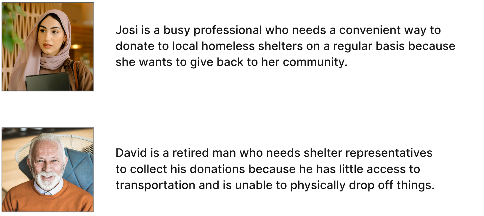
1. User Research
User stories
To begin empathising understanding the needs and preferences of specific user groups, two different personas were created to represent the target users for the
Helper app.
User stories were then built based on these personas, from which problem statements
were identified. Problem statements help designers decide on what product features to build, and when. Prioritising the essential user needs for the MVP is key to achieving a seamless user experience from the start.
User journey maps
Direct and indirect competitors were researched in a competitive audit, which was performed in order to identify gaps in the market and areas of improvement within existing donation platforms. Potential areas of improvement were identified with the help of user journey maps.
Pain points
Pain points
• Most existing donation platforms are difficult to navigate
• Most digital donation products lack a user-friendly interface
• Lack of transparency about how donations are used to help people
in need can be frustrating for users
• Most digital donation products lack a user-friendly interface
• Lack of transparency about how donations are used to help people
in need can be frustrating for users
2. Wireframing (Mobile Screens)
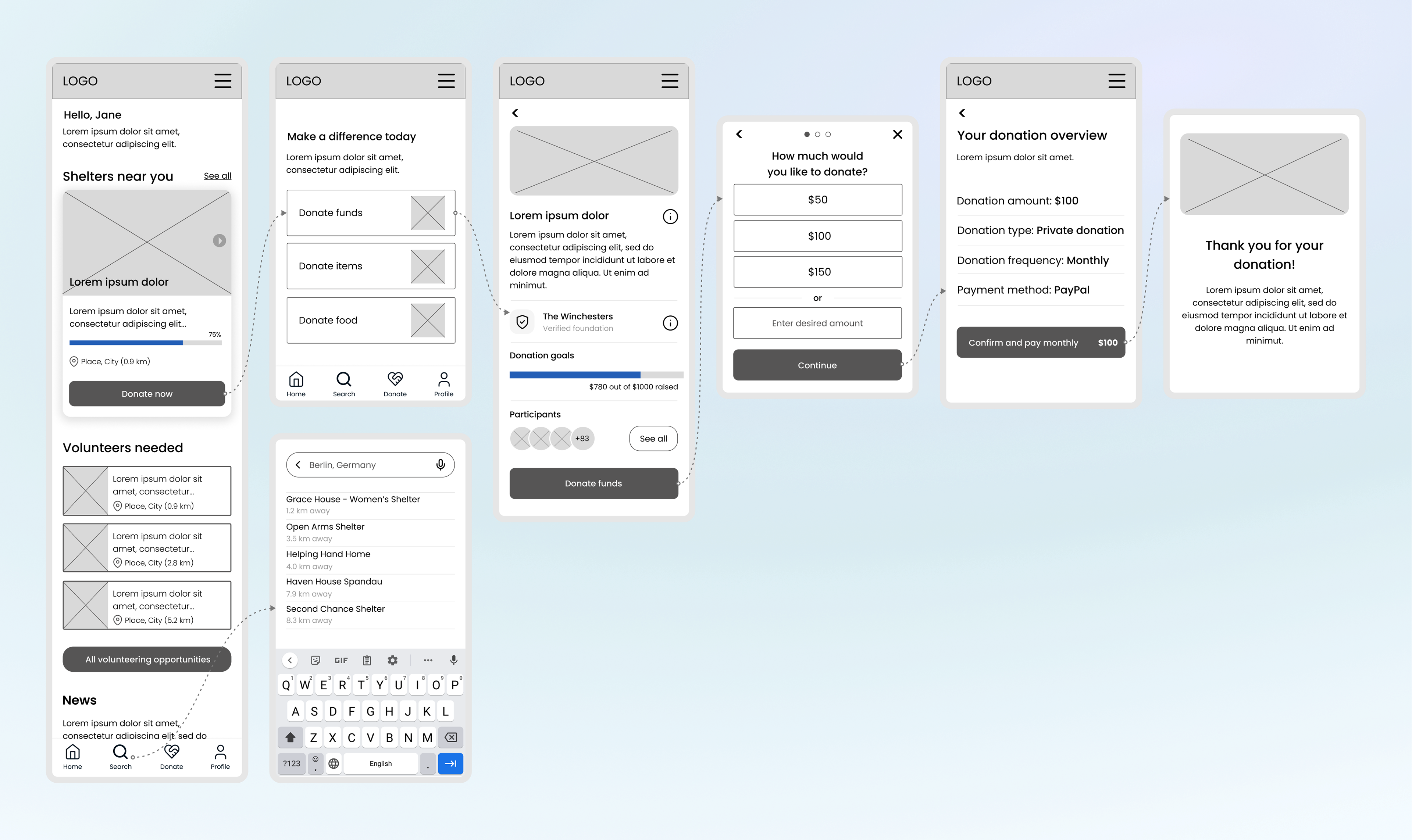
Helper app low fidelity wireframes
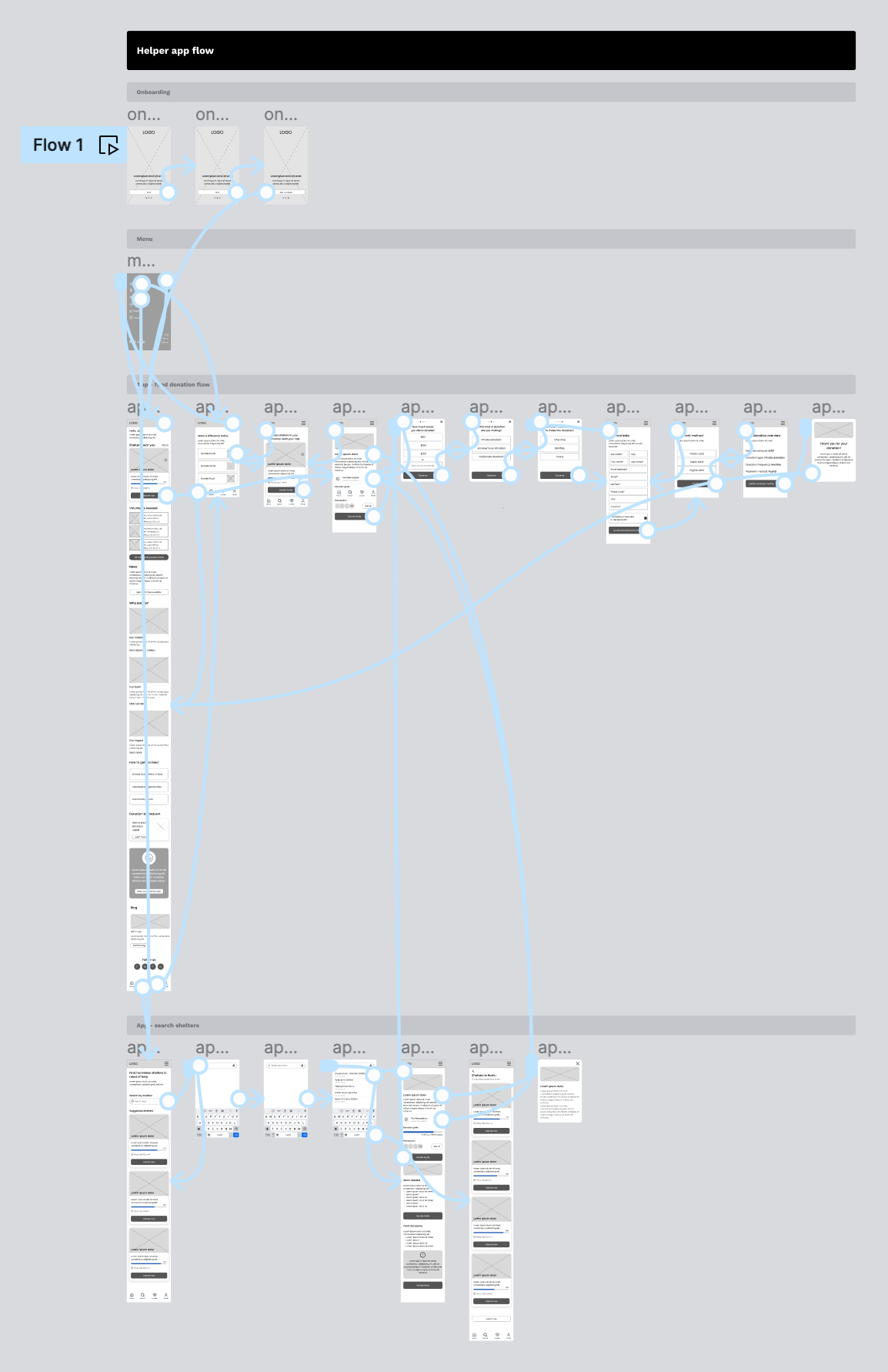
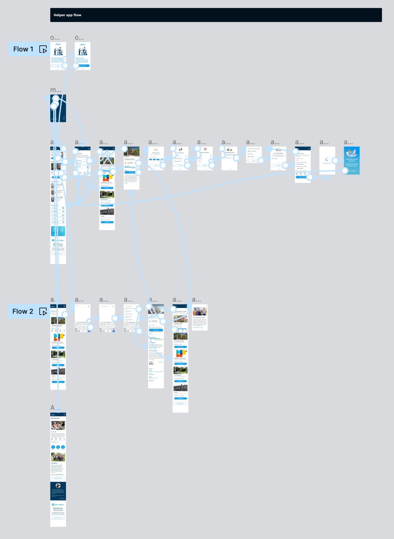
3. User Flows
Mapping out the main user flows: finding homeless shelters and making a donation.
View the low-fidelity prototype: https://www.figma.com/proto/yv7mKTMsUmnyZTFAhndqCP/Helper-App-%2B-Website?type=design&node-id=76-1685&scaling=scale-down&page-id=76%3A1684&starting-point-node-id=76%3A1685&mode=design&t=57gsxRtmxObXZr5M-1
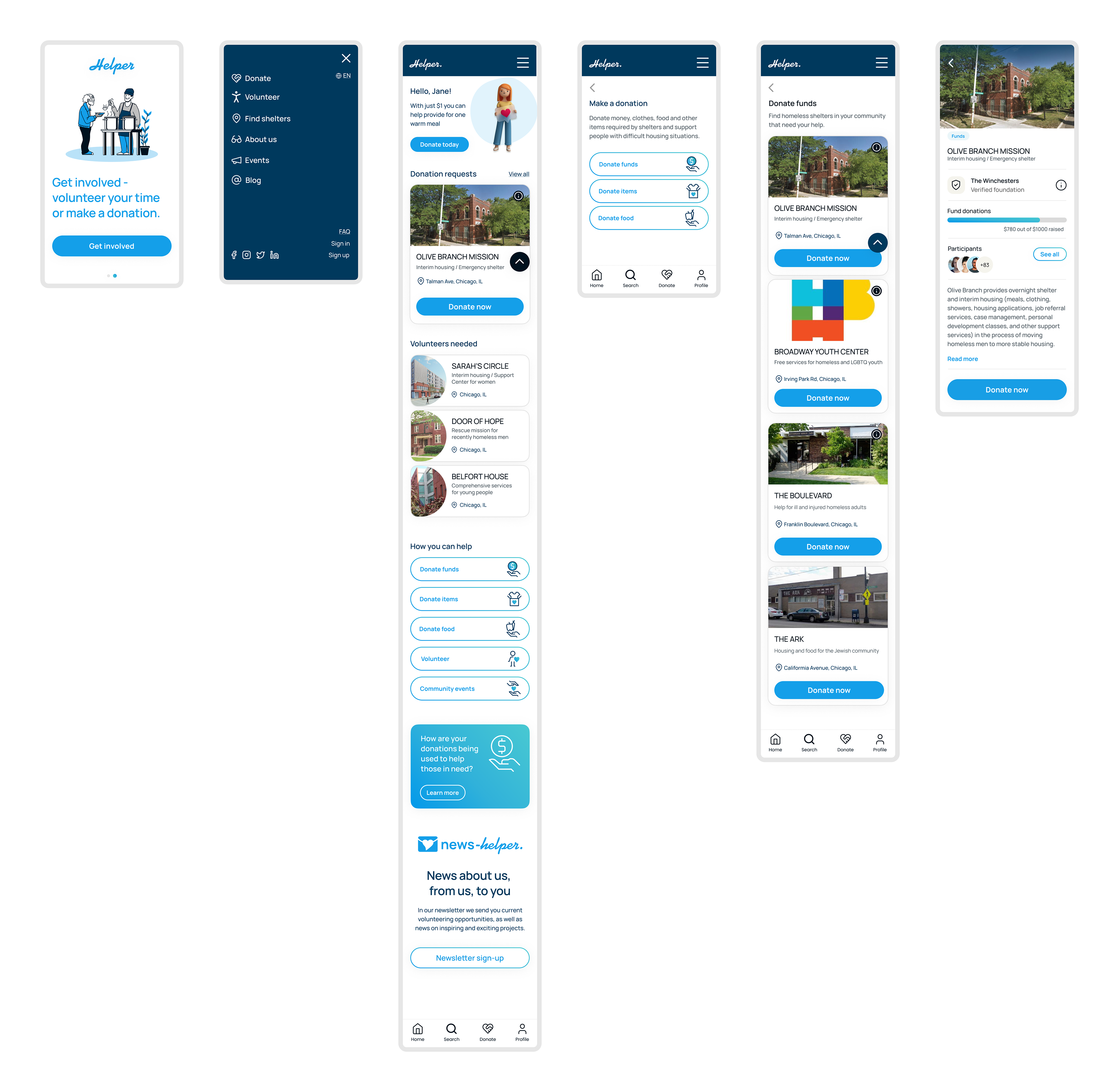
4. Interactive Prototype
• Clean and modern interface makes for a delightful user experience.
• Designed within the 8pt grid, which allows for seamless scaling to different screen sizes
• Staying up to date with the latest design trends by including 3D illustrations.
• "Back to top" sticky button was added for easy navigation.
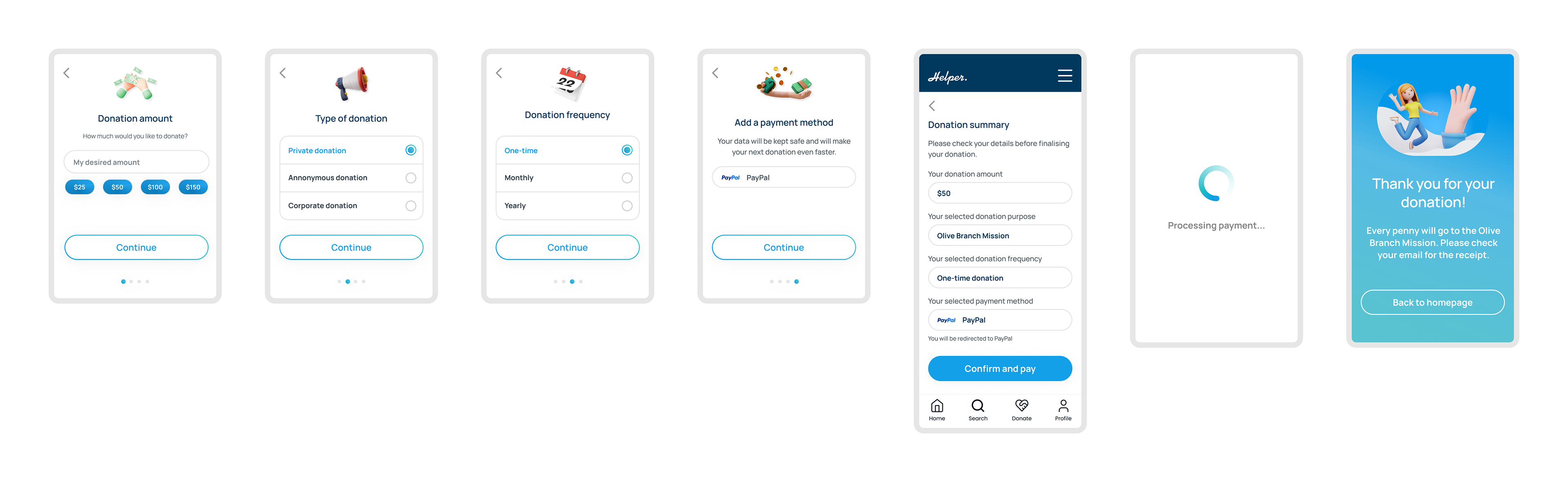
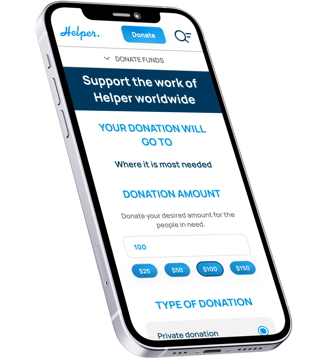
Helper app: donation flow
User Flows
Interactive components and animation tie the high-fidelity prototype together, bringing it as close to the finished product as possible.
View the high-fidelity prototype:
https://www.figma.com/proto/yv7mKTMsUmnyZTFAhndqCP/Helper-App-%2B-Website?page-id=894%3A11135&type=design&node-id=894-11468&viewport=-2844%2C-1055%2C0.59&t=eQoSmyOB4cV8e2j3-1&scaling=scale-down&starting-point-node-id=894%3A11136&show-proto-sidebar=1&mode=design
The Responsive Website

1. Wireframing (Desktop Screens)
Keeping the user flow structure similar to the mobile app, while implementing the appropriate website layout containing a hero section
and a footer.
and a footer.
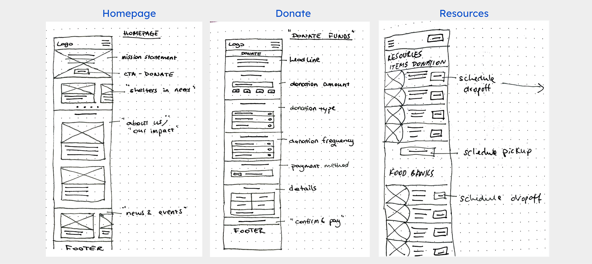
Paper wireframes (desktop screens)
2. User Flows
In contrast with the Helper app, the web-based version contains additional images, as there is more screen real-estate available. It also includes more detailed information about the product and services.

Low-fidelity wireframes (mobile)
3. Interactive Prototype
In contrast with the Helper app, the web-based version contains additional images, as there is more screen real-estate available. It also includes more detailed information about the product and services.
Helper website: high-fidelity wireframes (mobile)
High-fidelity wireframes (desktop)
Ensuring Accessibility
• I designed the visual interface with clear and distinct visual indicators, and provided clear descriptions so that they can be picked up by screen readers.
• I ensured that colour schemes, contrast ratios and font sizes are easy to read for users with visual impairments.
• Ensured interactive elements have an adequate touch target size to accommodate different levels of dexterity.
Going Forward
Impact
Helper eliminates geographical barriers and allows people to contribute from anywhere at any time. Providing a consistent and reliable channel for receiving donations allows shelters struggling with resource scarcity to better plan and allocate resources.
With real-time updates on donation usage, users will feel confident that their contributions are making a positive impact.
What I learned
During this project I gained a solid understanding of information architecture and became adept at creating user-friendly interfaces efficiently using the auto layout feature in Figma.
Next steps
• Build the screens for the other donation options (items and food donations).
• Add a Resources page with available clothes and food banks, clinic addresses and employment support.
• Conduct a usability test for the high fidelity prototypes of all screen sizes and determine areas of improvement.
• Conduct a usability test for the high fidelity prototypes of all screen sizes and determine areas of improvement.
Want to get in touch? Drop me a line!
Thank you!