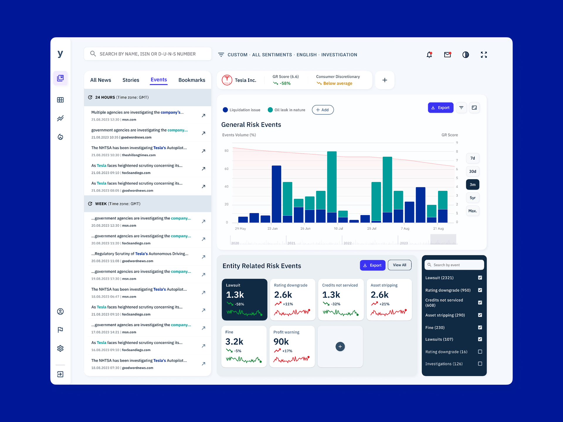
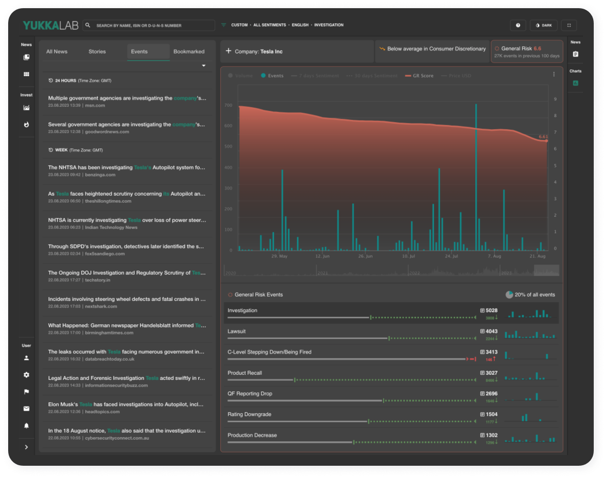
Dashboard for a SaaS platform screening news in real time.

Project Details
Challenge: Redesign the platform with clearer visualisations of news events detected
over a period of 100 days, in a time series chart.
over a period of 100 days, in a time series chart.
Solution: Build a clear and intuitive user experience with graphs and visualisations that are suited for the type of data displayed within the dashboard, allowing the user to efficiently analyse news events insights.
Project duration: Three-day challenge for a UX engineer role (August 2023)
Role: UX Designer for the News Lab platform redesign, from conceptualisation to delivery
Tools: Figma, FigJam, Google Workspace, pen & paper
Pain Points
1. Gaining deep insights into how different event categories impact market movements is challenging.
2. Analysing the impact of various event categories
can be time-consuming and labor-intensive.
3. Users may find it difficult to prioritise their efforts without a clear overview of which event categories
have the most significant impact.
2. Analysing the impact of various event categories
can be time-consuming and labor-intensive.
3. Users may find it difficult to prioritise their efforts without a clear overview of which event categories
have the most significant impact.
Solution
For financial professionals that need to visually distinguish between different event categories, our new product feature consists of a filter for event categories, with the
option to add custom keywords.
This helps professionals manage entity portfolios and obtain clear visual data displaying
the impact of news sentiments on these entities.
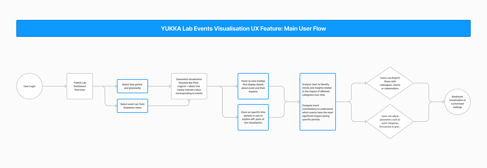
User Flow
Mockups